Welkin Health: Logo rebrand
Welkin empowers health organizations to deliver patient-centered care.
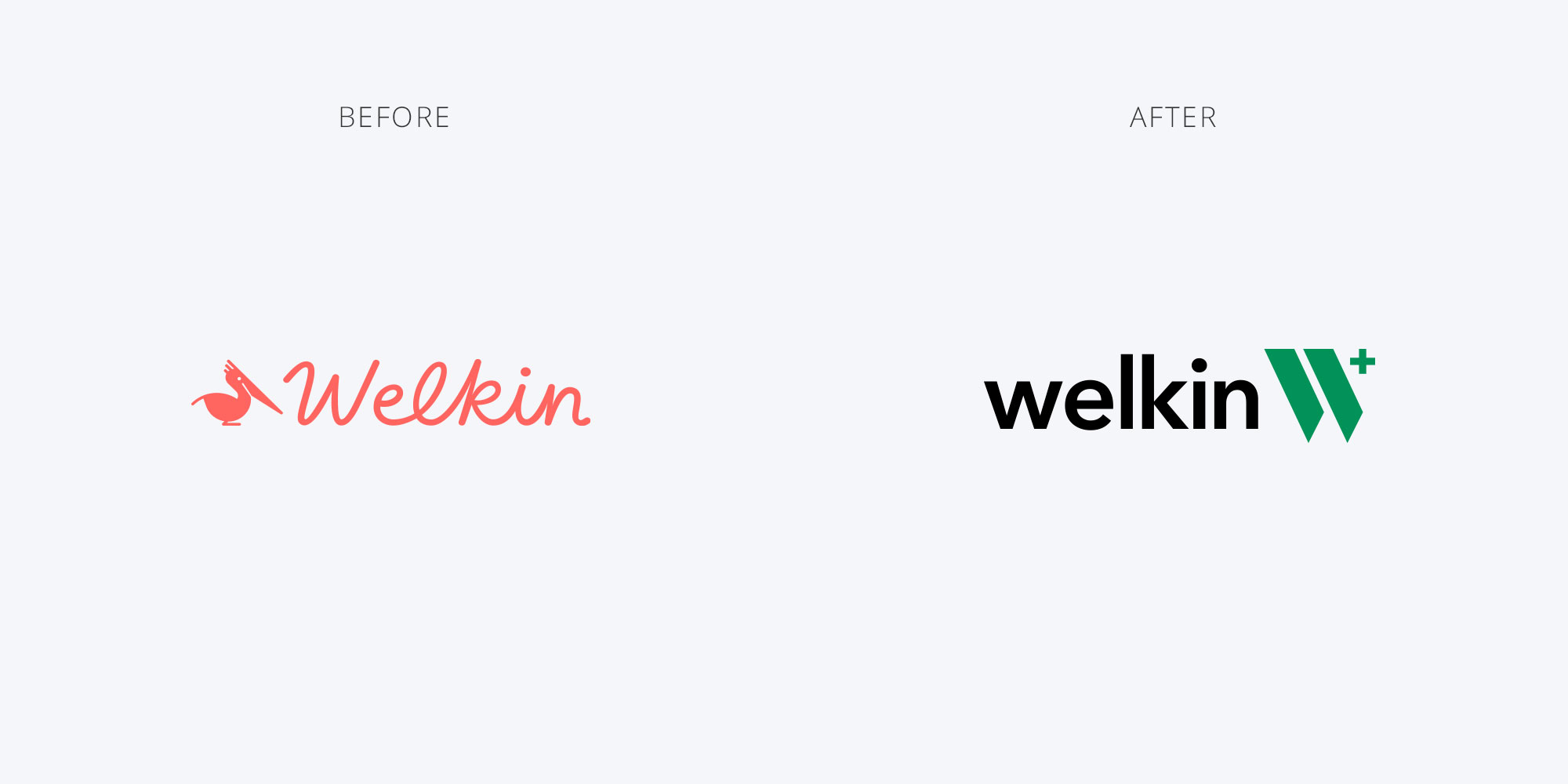
The team was looking to upgrade their logo in 2021 to reflect their upgraded software offering. The previous logo was a bit too playful for their taste. It was brightly colored and had a pelican that didn't connect with their brand. It had a cursive font that didn't represent the modern product feel they were going for.
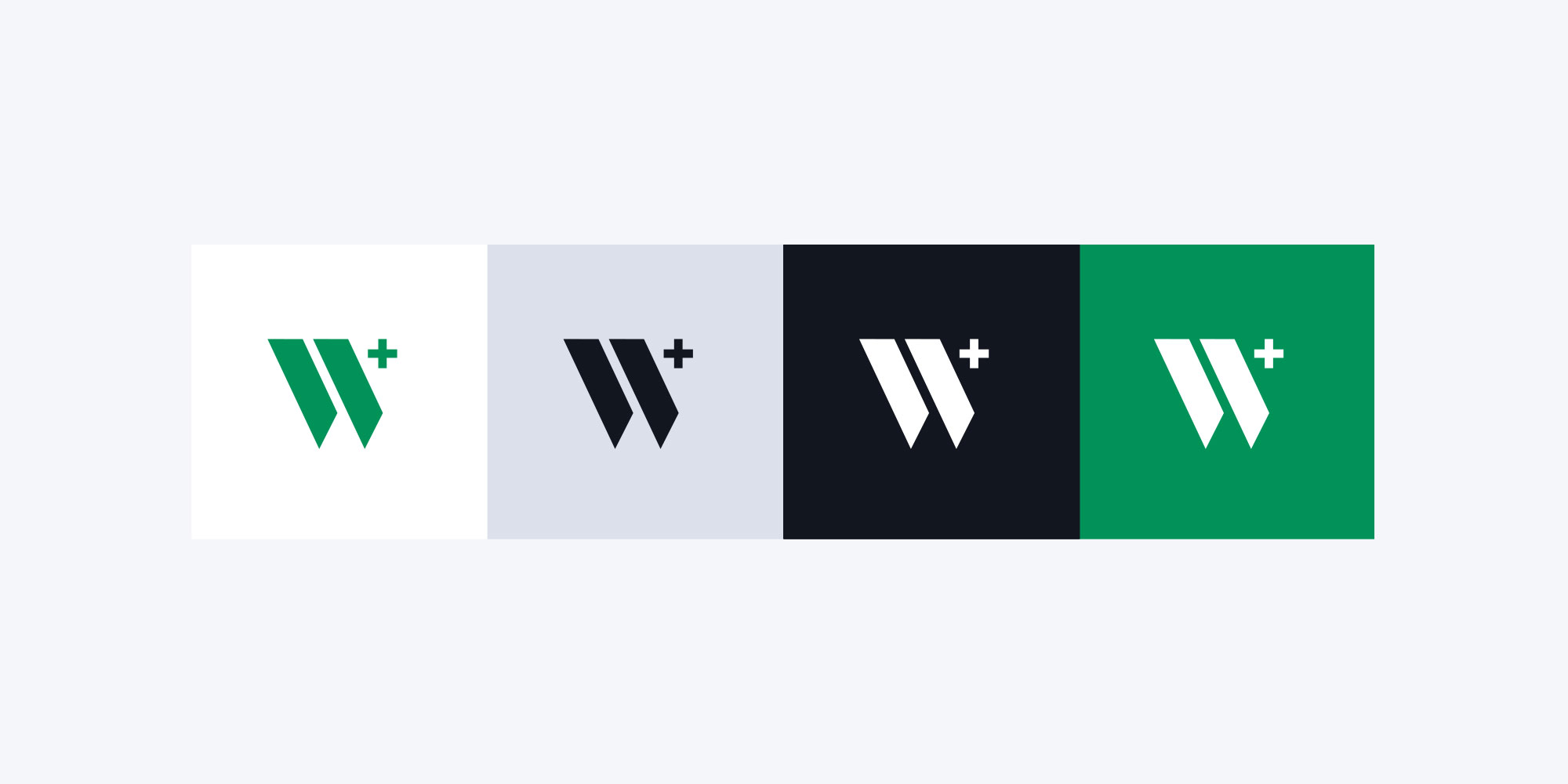
Green was selected as one of the core colors of the brand from welkin health’s team. The new logo is bold, professional, and reflected their vertical (healthcare).